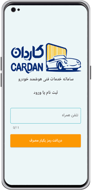
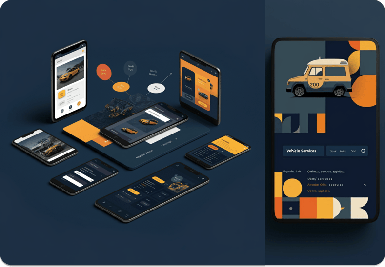
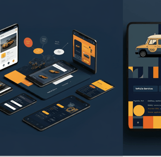
CARDAN
Mobile phone Application Redesign
CARDAN
The startup Cardan has introduced an intelligent automotive service system in Isfahan province, Iran, to enhance car owners' services. This dedicated platform focuses on vehicle identification, connecting car owners with skilled service providers, and improving communication between these groups.

Our UX design team has been assigned to conduct research and develop a modern, user-centered, and intuitive smartphone application redesign to enhance the user experience and increase app subscriptions.
PROJECT OVERVIEW


My Role
Product
Duration
Group of 4
UX Research
and Design
Redesign application
3 Months
Figma, Figjam, Zoom, Sketch,
Card Sorting tools
Team
Tools
Challenges


Design goals
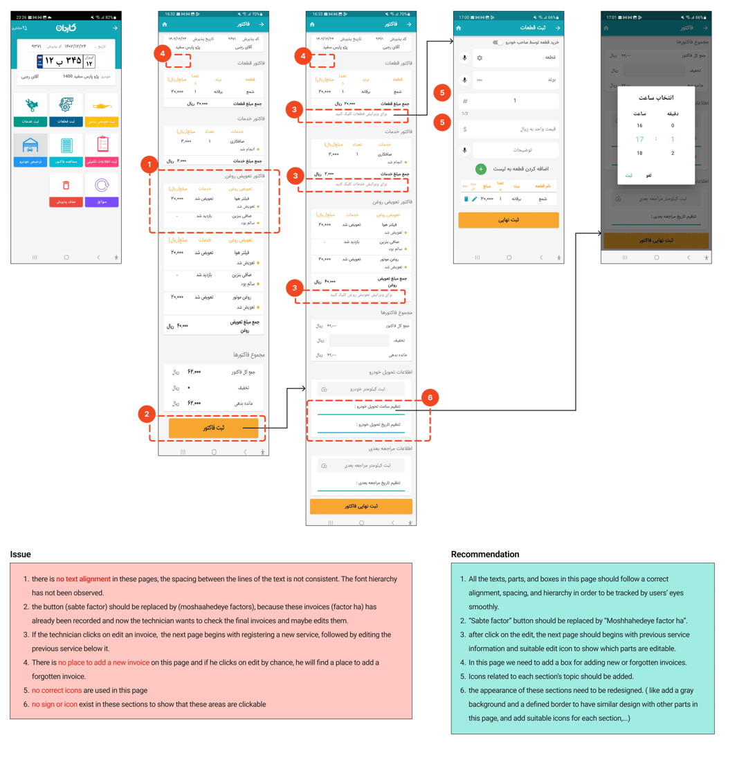
The current app lacks a clear outline of its business goals and services.
Its design and layout are unappealing, making navigation difficult for users who need to find specific information.
The app does not have a feature that allows users to locate automotive services on a map and book appointments.
It suffers from poor visibility and an unattractive visual design.
Simplify navigation for adding new vehicles to user profiles.
Improve the search functionality to find desired technicians in the area easily.
Enhance the display of a variety of services offered by Cardan that are currently overlooked by users.
The Process
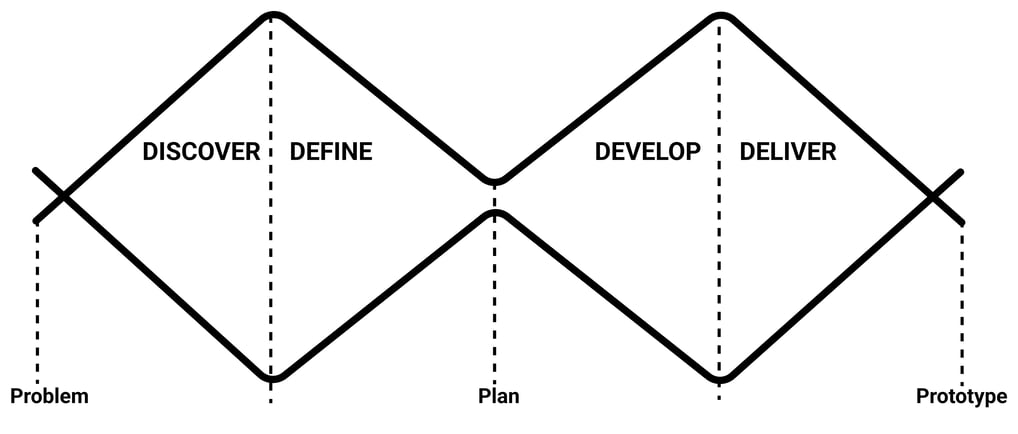
DISCOVER
Identifying the Problems
To begin, my team and I thoroughly explored the existing application, attempting to find and select an activity. During our initial exploration, we discovered several pain points:
Heuristic Evaluation
2. Services page
4. Setting
1. Customers' onboarding
3. Creating an account
Competitive Analysis
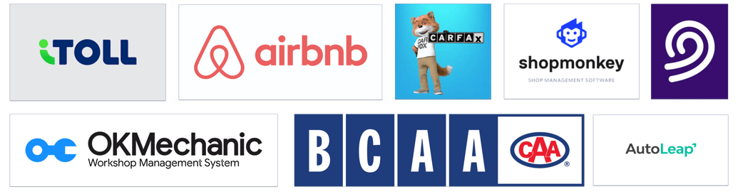
As part of our research, we analyzed potential competitors and studied popular auto service apps in Iran and North America. Our goal was to compare and identify the key features these apps offer and how they present this information to users. By incorporating similar features into Cardan, we aim to enhance the user experience.
Major takeaways
User-Friendly Interface: Successful apps like OK Monkey and Itool prioritize a user-friendly interface, making it easy for users to navigate and find the services they need quickly.
Comprehensive Service Offering: Apps such as BCAA stand out by offering a wide range of services, but there is a risk of overwhelming users. A balance between variety and simplicity is crucial.
Advanced Diagnostic and Management Tools: Shop Monkey and Auto Leap excel with their advanced shop management and diagnostic tools. Incorporating similar features can enhance functionality for both service providers and users.
Integration and Visibility: Carfox’s integration with dealerships and detailed vehicle history reports demonstrate the value of partnerships and providing detailed, accessible information to users.
Booking System: An intuitive booking system, as seen in OK Monkey, is essential for user satisfaction. Ensuring that the booking process is seamless and transparent can significantly improve user experience.

Cart Sorting
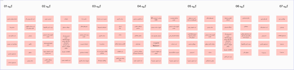
Amin
Iman
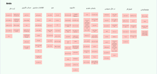
Sahar
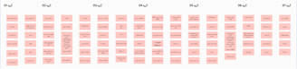
During the next phase, we carried out a series of open and closed card sorting sessions. Despite our best efforts, the results did not provide clear or consistent outcomes, emphasizing the necessity for further refinement in our approach. Due to the unavailability of the app's actual users, we had to conduct multiple rounds of card sorting with both users and business owners to ensure the reliability of our research findings.
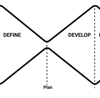
DEFINE
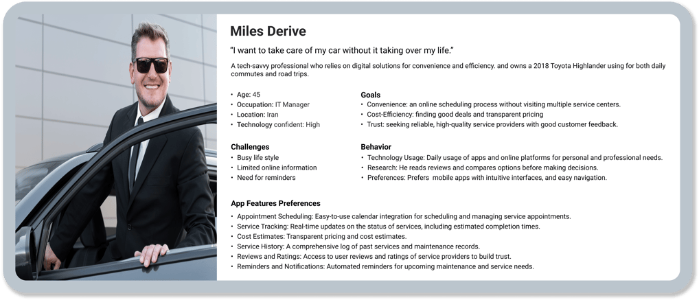
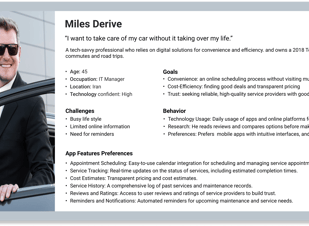
After conducting comprehensive user research, including interviews, card sorting, and a heuristic evaluation of the previous app, we developed a persona for our automotive service app.
Meet Miles Derive: he has recently moved to a small city in Iran after being promoted to IT manager. Miles is currently facing the challenges of adjusting to the new city and its residents.
Persona
According to what Miles needs:
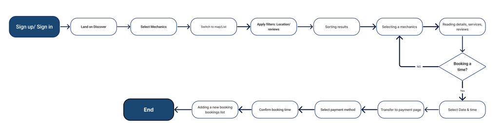
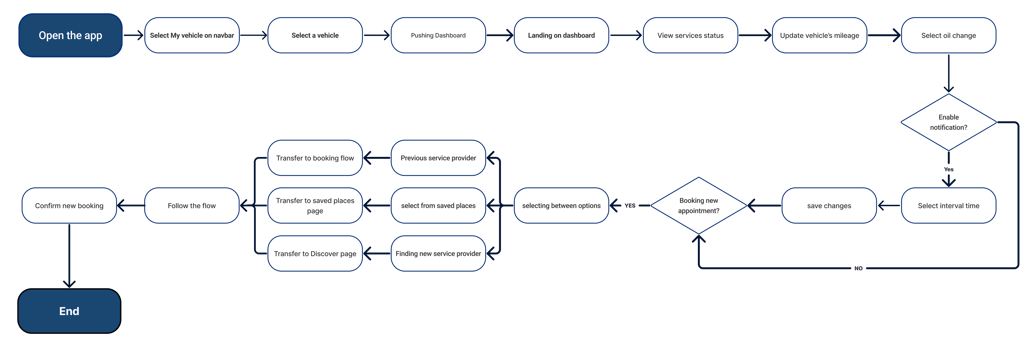
We initiated the design process with an idea and then conducted a user flow to illustrate the journey through browsing the Cardan app.
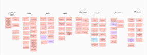
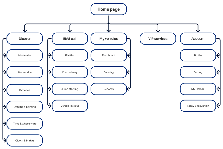
Through several rounds of card sorting and other user research methods, such as comparative analysis, we were able to reorganize the sections of the Cardan app and create the initial version of our site map. However, after conducting user testing and competitive analysis, we finalized the site map.
User flow
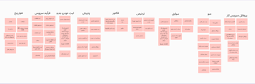
Site Map
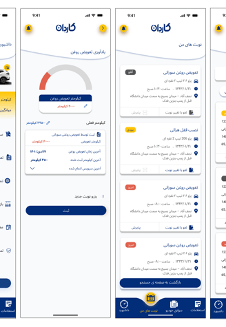
Booking
DashBoard
DEVELOP
Ideations
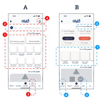
1. Between these two (horizontal/vertical) scrollings, users were more comfortable with Vertical.
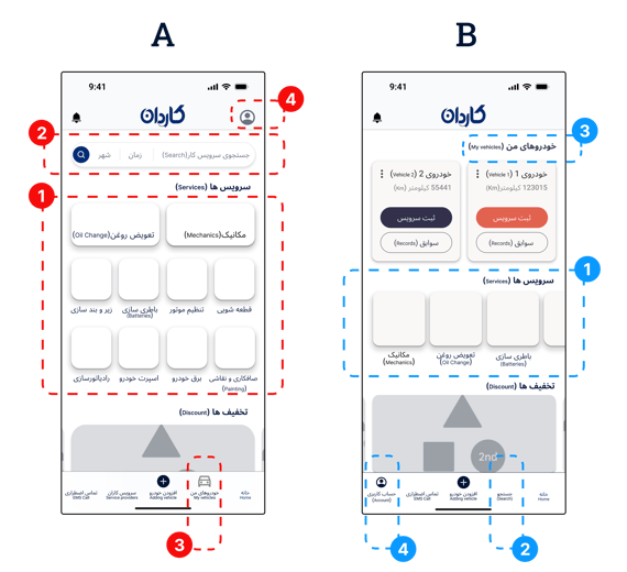
2. The "Searching" part has been preferred to locate on the Navbar. However, after multiple iterations, it is backed to the header ( I will discuss this later in the developing phase.
3. The "My Vehicles" section was initially selected to be moved from the navbar to the top of the landing page. However, in subsequent iterations, which I will explain later, it was moved back to the navbar due to its significant importance.
4. The "Account" section was selected to be placed in the bottom navigation bar due to its importance and the need for continuous access.
A/B Testing
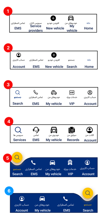
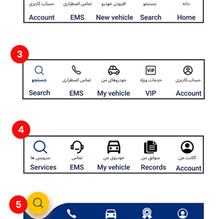
Navbar
The Cardan's navbar has undergone several exciting iterations to enhance its features.
1. One of the pivotal revenue-generating features was the convenient option for users to add vehicles to their car list, ensuring quick access.
2. Additionally, the app's primary feature, searching for a car service, underwent rigorous review and A/B testing multiple times to ensure utmost clarity, ultimately selecting the term "Search."
3. The emergency call functionality, which emerged as the second revenue-driving feature, was carefully integrated into the app's main tab after numerous iterations and user feedback.
4. Although VIP services, originally intended as the third revenue-generating feature for swift user access, were removed in the final development phase due to inadequate infrastructure, the app's owners have ambitious plans to reintroduce VIP services in future updates.
DESIGN
Mood board
Pages Iterations
First version
Second version
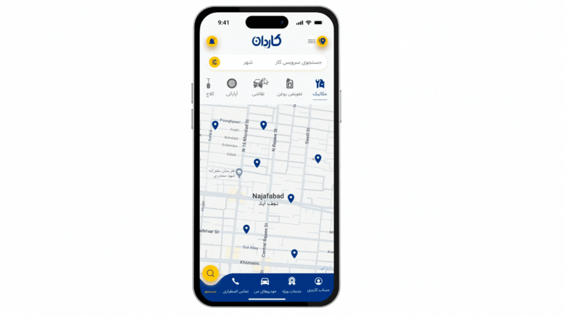
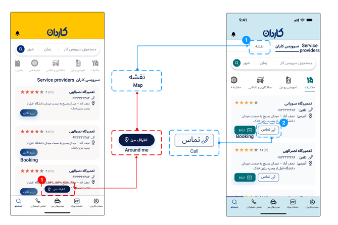
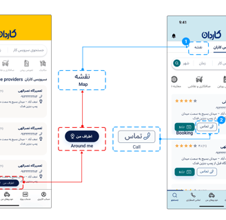
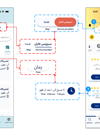
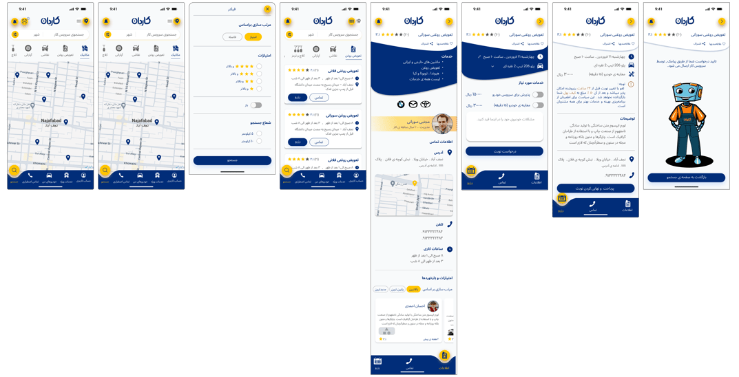
1. The map feature was initially labelled "Around Me" and placed as a floating button at the bottom of the screen. However, since it was overlooked by users, it was relocated as a clickable button at the top of the screen, next to the "Service Providers" section.
2. The option to make direct calls, in addition to booking online through the app, was added to the service providers' cards after usability testing
Search page
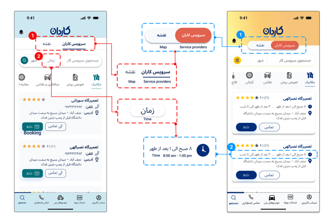
1. The option to switch between the list of service providers and viewing the map was changed to more visible buttons at the top of the screen because the ability to view service providers on the map did not attract enough user attention.
2. Filtering by service providers' open hours was removed from the search filtering due to inefficiency, and the information regarding their working hours was moved to the service providers' cards.
Third version
Second version
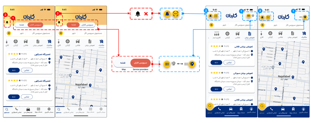
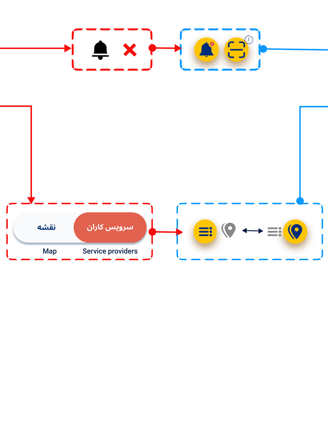
1. For better management and more efficient use of the available space, the buttons to switch between the list of service providers and the map were replaced with icons related to these functions, which were recognizable and familiar to users. Additionally, the icons were placed in a higher position on the search screen.
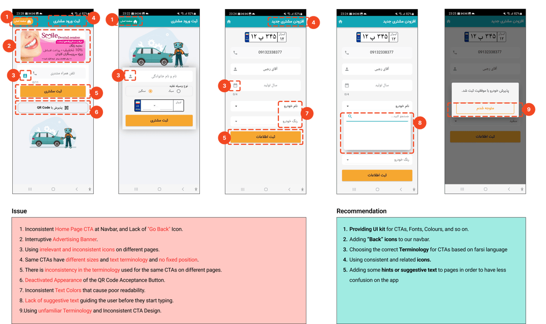
2. To enable quicker access to the scan feature, which allows for the fast acceptance of a user’s vehicle at a selected repair shop during in-person visits, a scan icon was added to the page header and aligned with the notification icon in a higher position. ( Further details regarding the vehicle acceptance process will be discussed later in the case study).
Third version
Final version
My vehicle page
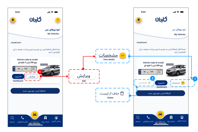
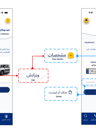
1. Users didn’t realize the edit button showed their vehicle details. To improve clarity, it was replaced with a details view button that allows expanding and editing information.
2. A delete button was added to the vehicle card to give users more control and provide reassurance about the option to delete a registered vehicle.
First version
Second version
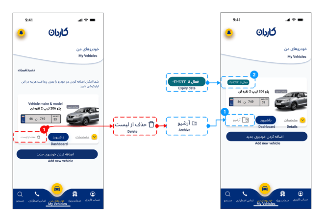
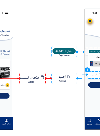
1. To provide a complete archive of vehicle records within the app, the option to delete a registered vehicle has been replaced with an "Archive Records" button.
2. Since adding a second or additional vehicle in the Cardan app requires an annual subscription fee, the subscription expiration date has been added to the vehicle card for user convenience and better awareness.
Final version
Second version
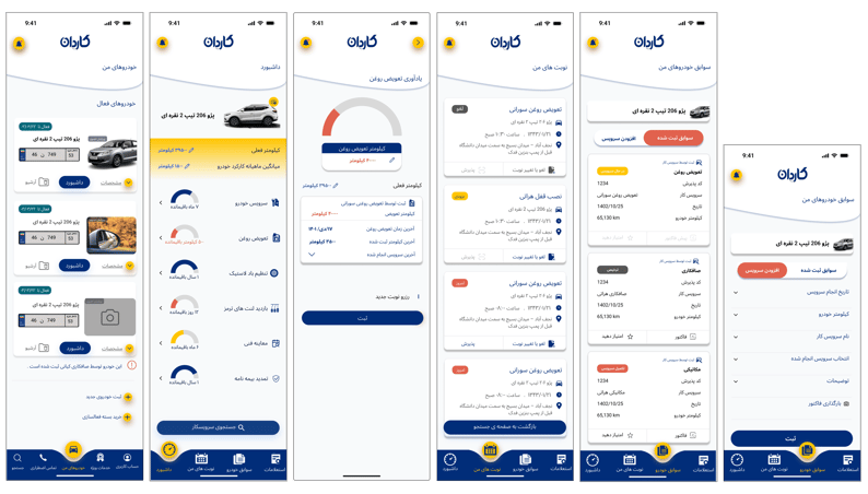
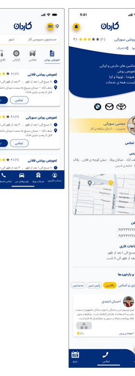
Dashboard page
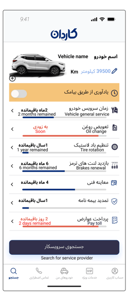
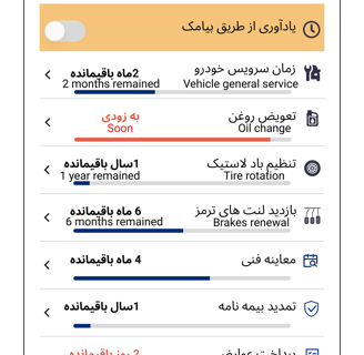
One of the most interesting design challenges on the dashboard page was how to display the remaining time for the next service and the renewal of official vehicle documents.
In the first version, approaching the renewal date for services and vehicle documents was shown with a progress bar that turned red to highlight the expiration date and grab users' attention. However, usability tests revealed that the filling bar gave users a false sense of having enough time, similar to a full fuel tank. Additionally, the red color reduced users' understanding of the process, indicating the design was confusing.
First version
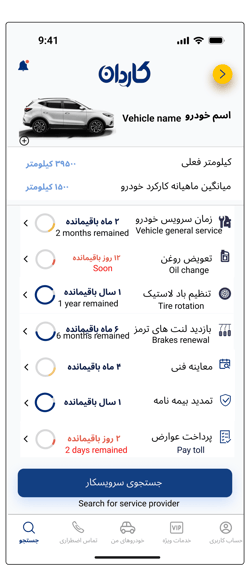
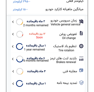
In the second version, the renewal date was displayed as an emptying circular chart that gradually changed to yellow and then red as it approached the end (similar to the concept used in traffic lights). However, the circular path again confused some users, and the intended message was not clearly conveyed to their minds.
Second version
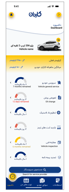
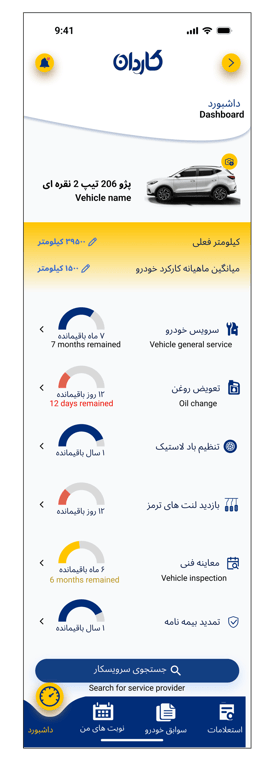
Final version
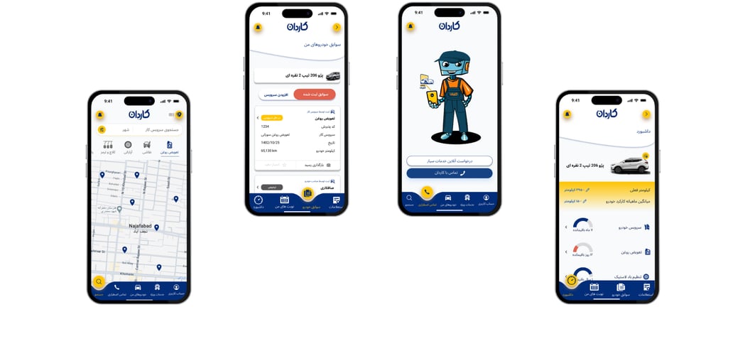
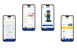
DELIVER
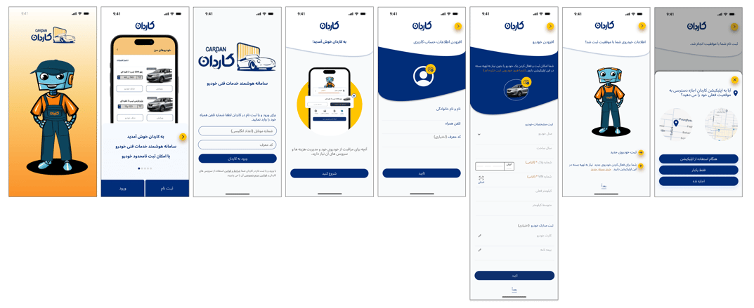
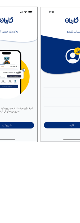
Sign up
My Vehicle
Profile
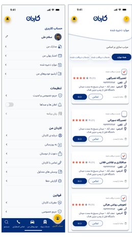
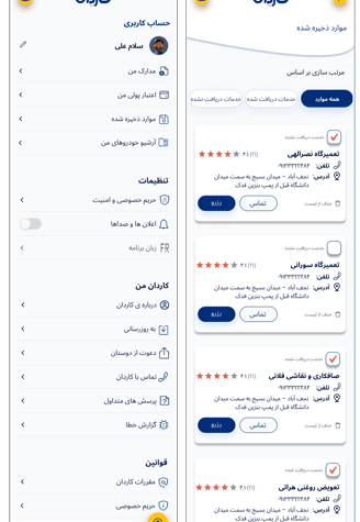
Search
Reflection
1. Twelve living languages, including Persian, Arabic, and Hebrew, are written from right to left. The importance of right-to-left alignment of elements and features, and accurate information architecture based on user-friendliness for this user group whose eyes are accustomed to right-to-left reading, was the most significant challenge in this project.
2. In product design, paying attention to elements and objects that the target users are already familiar with in their surroundings can significantly enhance the effectiveness of the design. Drawing inspiration from these familiar elements helps the design become more impactful and makes it easier for users to learn and adapt quickly. For example, using concepts like traffic lights or a car's fuel gauge in the Cardan app, where most users are car owners familiar with driving rules and these concepts, can lead to faster user understanding and acceptance