Mount Antero Gallery
UX/UI- Website Design
Mount Antero Gallery Jewelry Website
Our school project involves designing a high-fidelity prototype for the Mount Antero Gallery jewelry website. The primary goal is to create an intuitive and visually appealing online shopping experience that meets the needs of both new and returning customers. This prototype will incorporate a creative AI feature to enhance user engagement and simplify the shopping process.
PROJECT OVERVIEW

My Role
Product
Duration
Group of 4
UX Research and Design
Design Website
6 weeks
Figma, Zoom,
Card Sorting tools
Team
Tools
As an e-commerce business, this jewelry store is confronted with several challenges. Firstly, the intense competition among online rivals has made it increasingly difficult to attract customer attention in the digital world. Secondly, while traditional in-person jewelry shopping may provide a physical interaction with the product, it can be time-consuming and expensive, particularly in large cities. This issue becomes even greater when considering individuals with allergies who require special hypoallergenic products, making it even more difficult to find the right items for their needs.


We improved the online visibility of the jewelry store by building a modern, user-friendly, and secure website. This platform makes it easy for customers to browse through a wide range of jewelry, including hypoallergenic options. To enhance the shopping experience and make it feel more like in-person shopping, we introduced a virtual try-on feature that lets customers see how the jewelry would look on them before making a purchase.
Challenges
Design goals
The Process
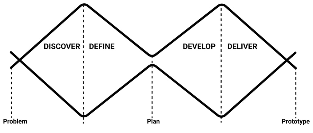
DISCOVER
Survey
Key Takeaways:
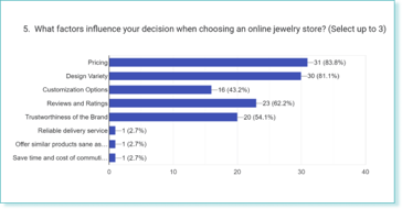
1. Pricing (83.8%), design variety (81.1%), and customization options (54.1%) were significant factors influencing the choice of an online jewelry store.
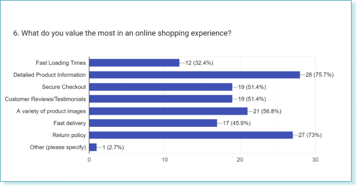
2. Detailed product information (75.7%) and secure checkout (75.7%) were highly valued aspects of the online shopping experience.
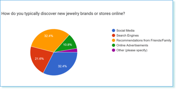
3. Social media (32.4%) and search engines (32.4%) were the primary channels through which respondents discovered new jewelry brands or stores online.
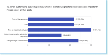
4. Design or style customization (81.1%) and the type of metal/material used (59.5%) were important considerations when customizing jewelry products.
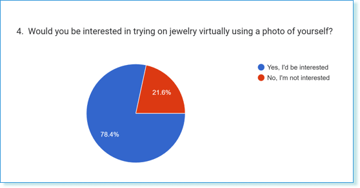
5. A notable 78.4% of respondents expressed interest in trying on jewelry virtually using a photo of themselves.
After Research, we wanted to gather feedback from the existing users. We interviewed some of our respondents.
To set the research in the right direction, our first step was to craft an online survey to research the experience of our possible users, discover their needs, and unpack the insights.
Interview

Common Response
Major takeaways
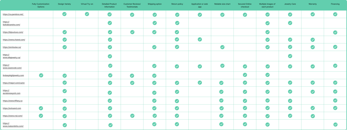
As part of our research, we performed research on potential competitors and analyzed renowned jewelry brands. Our aim was to identify the key features that these brands offer to their customers so that we could incorporate similar features into our website and deliver an exceptional user experience.
Cometitive and Comparitive Analysis
Strength points:
1. Multiple images of jewelry
2. Detailed product information
3. Business policy about warranty, return option, financing, and product care
Weakness points:
1. Lack of virtual try-on option
2. Lack of Customer reviews
3. Lack of Full customization option
We have identified some key strengths that set Mount Antero Gallery apart from our competitors. To stay ahead of the game, we have decided to actively promote these strengths and leverage them to gain a competitive edge.
We also did a comparative analysis to Learn which features were the most common on our competitors' home pages and Figure out how they prioritized their content, information architecture and presentation of their websites.
There were a total of 15 questions and we received a total of 87 responses. We followed up with 11 participants.
Platform: Google Survey
Responses: 87
Define Research
With the survey, we understood who could be our potential users and what they wanted.
We conducted follow-up interviews with 11 participants of the survey to gather more insights about their experiences with online purchases and jewelry stores. During the interviews, we asked open-ended questions and allowed them to share their positive and negative experiences. The results of the interviews were used to create an affinity map and develop our research-based persona.
DEFINE
Affinity Diagram
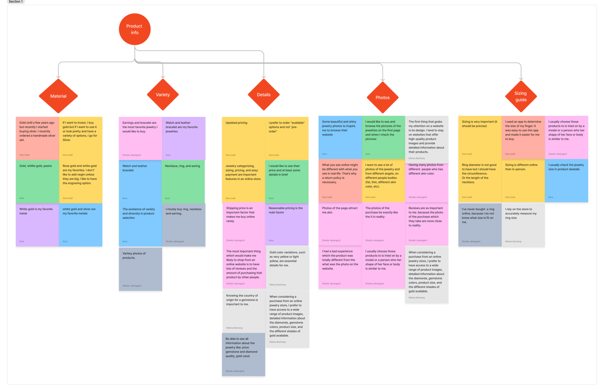
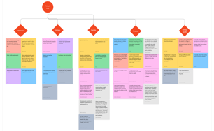
During our research process, we conducted an affinity mapping exercise to synthesize and analyze the findings. This method proved to be effective in grouping all our research data into themes, highlighting insights, and identifying the main problems to solve. We used this exercise to categorize pain points, brainstorm potential solutions, and develop a comprehensive persona.
Users’ common needs and pain points
1. lack of time for shopping and prefer online shopping
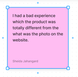
2. the picture of the product on the website might be different from the real one
3. sizing is different online than in-person
4. need to see pieces of jewellery on their bodies.
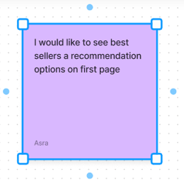
1. Like to see the product menu on the home page
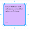
2. Like to see the best-seller recommendation option on the first page
3. Return policy and shipping option
Important recommendations or features
1. What you see online might be different with what you see in real life. That’s why a return policy is necessary.
2. Be able to see all information about the jewelry like the price of gemstone and diamond quality, gold carat.
3. When considering a purchase from an online jewelry store, I prefer to have access to a wide range of product images, detailed information about the diamonds, gemstone colours, product size, and the different shades of gold available.
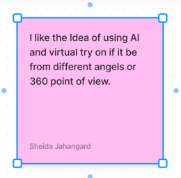
4. I'd like to see a piece of jewelry featuring various gemstones and available in different shades of gold
5. I once had an experience where I purchased a ring with fake diamonds, which has made me more cautious about where I shop.
Some users quotes or USERS STORIES
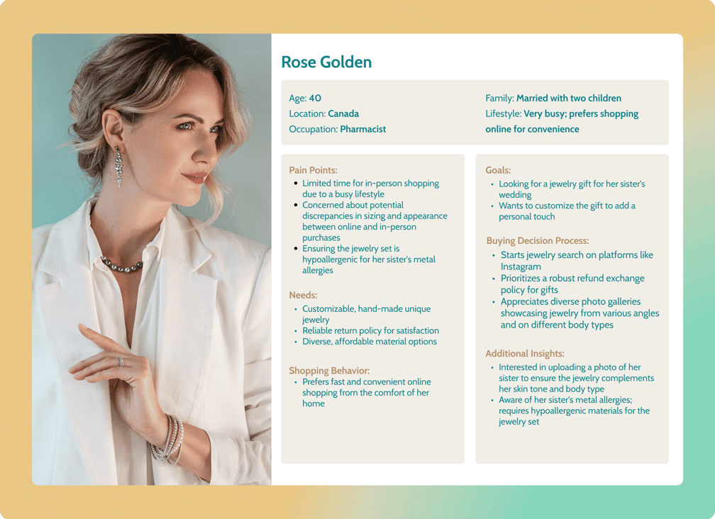

Meet Rose Golden
A 40-year-old pharmacist mom with 2 kids. As a busy person since she runs her own business Rose prefers shopping online for convenience. She needs to be able to complete tasks online without spending too much time online.
Rose's pain point:
1. Limited time for in-person shopping duo to busy lifestyle
2. Concerned about potential discrepancy
3. Looking for hypoallergenic products
Needs:
1. Customization
2. Reliable return policy
3. Diverse products
Based on the Survey Method, User Interview, Comparative & competitive analysis, Contextual research, and Affinity Mapping we developed the Persona. I referred to her throughout the entire product development process.
Persona
DEVELOP
According to what Rose needs
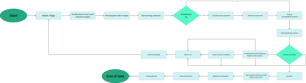
we developed our idea to start our design process. For developing the idea we considered A Scenario to respond to our Persona's needs, and we conducted the user flow to show her journey through browsing the website.
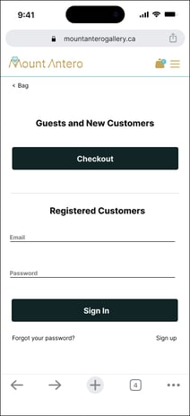
Rose, a busy pharmacist, is searching for the perfect gift for her sister Venus, whose wedding is approaching. With limited time, Rose wants to purchase from a reliable website offering secure payment and shipping options. Venus has metal allergies, so Rose needs hypoallergenic jewelry options. She also wants to upload Venus' photo to virtual try-on jewelry. After finding a reputable jewelry website, Rose filters for hypoallergenic options and uploads photos to see how the jewelry looks on Venus. She selects a piece, securely enters payment information, and receives a confirmation email with the estimated delivery date. The website offers customization, gift wrapping, and expedited shipping options. Rose feels relieved and satisfied with the convenient and personalized experience, knowing she found the perfect gift for Venus amidst her busy schedule.

Scenario
User flow
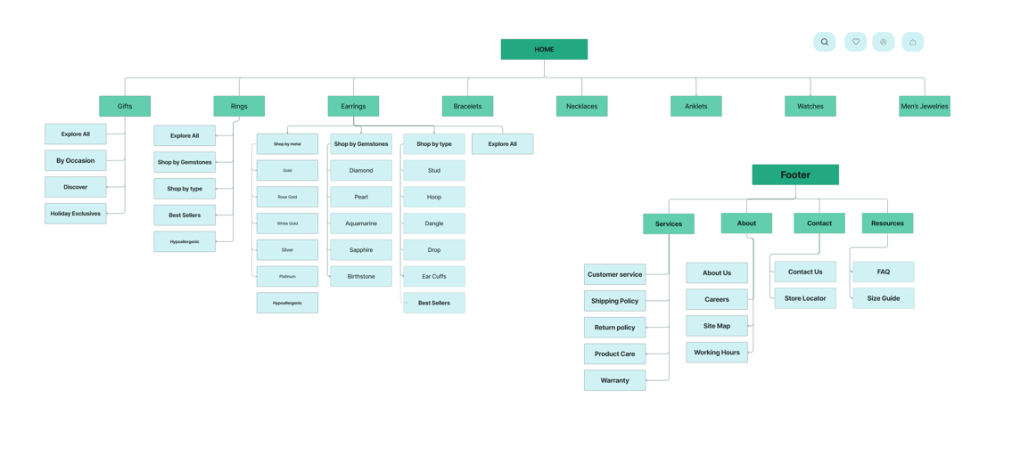
During our cart sorting exercise, we requested our users to classify related items based on their priorities and classification. Surprisingly, we noticed that each person had a unique way of categorizing and sorting the cards. It became evident that people have different ways of thinking based on their backgrounds and priorities. After analyzing the card sorting results, we created a site map that aligns with the users' mental model of the site. Our focus is always on the users' needs and how we can make their experience easier and more enjoyable.
We developed the site map. This is my final site map after a few iterations.
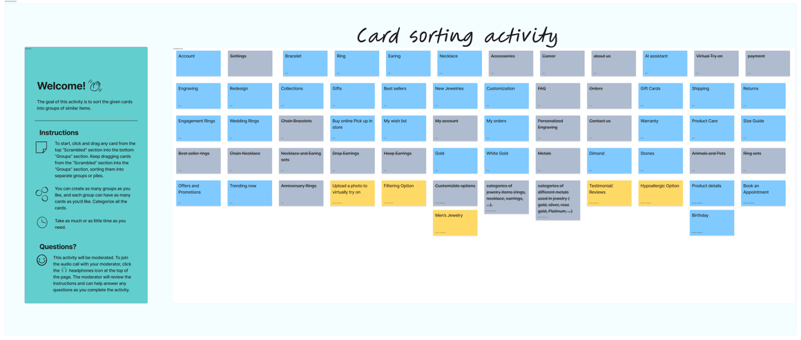
Card Sorting
Sitemap
DESIGN
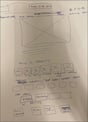
Sketch
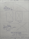
Low Fidelity
Mid Fidelity
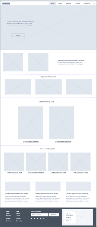

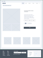
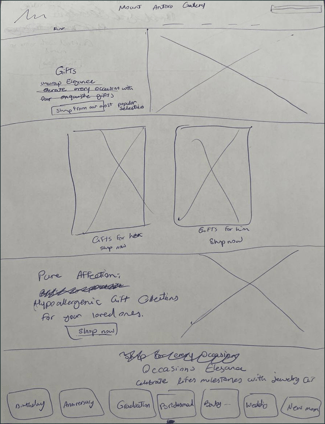
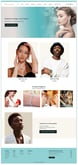
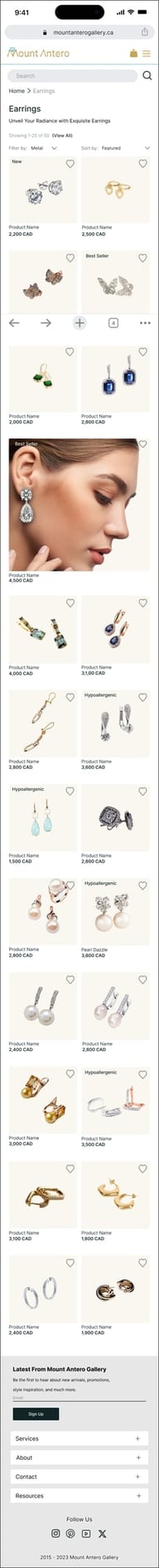
Home Page
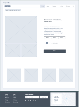
Product Page
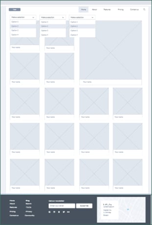
Category Page
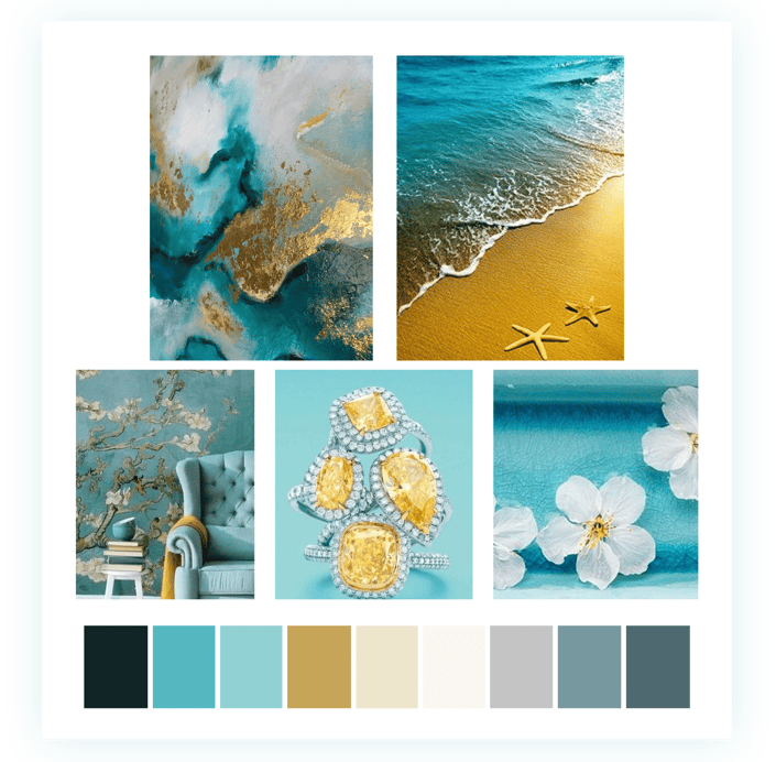
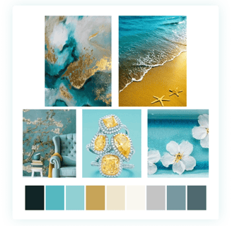
Mood Board
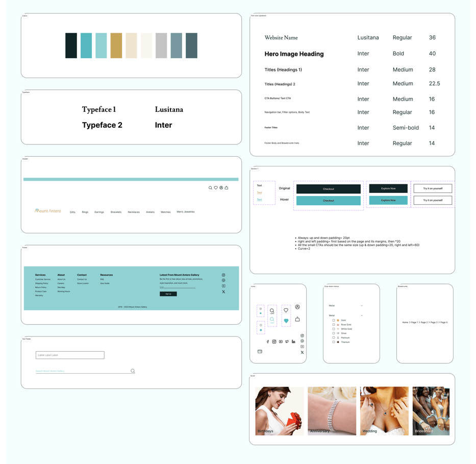

UI Kit
Iterations

Home Page Iterations
Version 1
Version 2
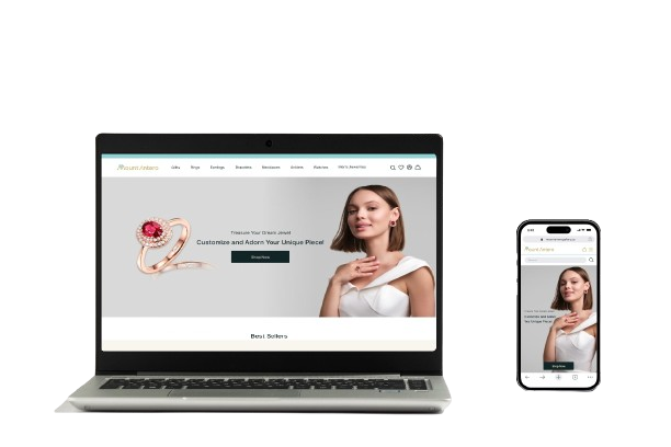
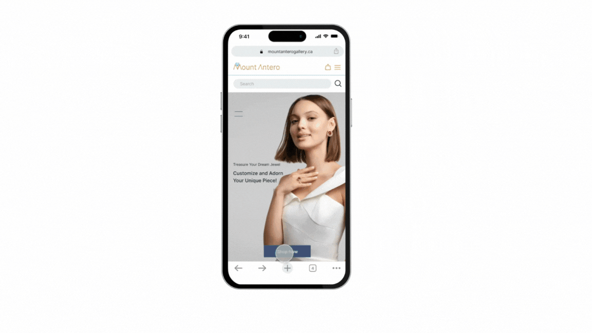
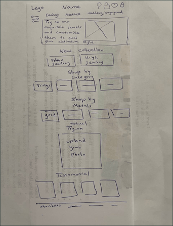
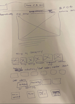
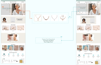
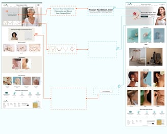
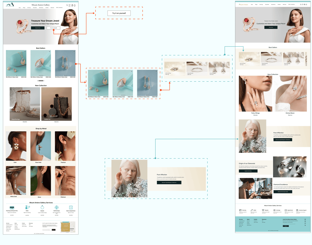
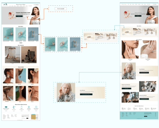
To highlight the customization option as a key value proposition of the business, we have implemented some modifications to the hero image.
1. The updated image now shows an animated view of the necklace changes as the main focus.
2. An attention-grabbing hero headline that highlights this option, drawing visitors in and sparking their interest in the customization feature.
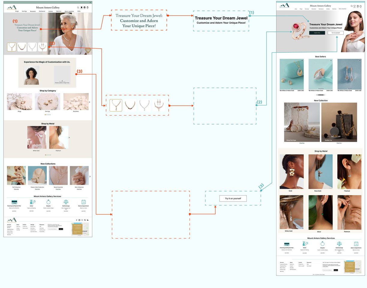
Version 2
Version 3
1. Modifying the font style to enhance readability, particularly for users with visual impairments, ensuring better accessibility and user experience.
Based on feedback, the "try-on" button has been removed from the hero image, as it was considered out of place. It has been moved to the product page, where its purpose will be better explained in the next update.
Version 3
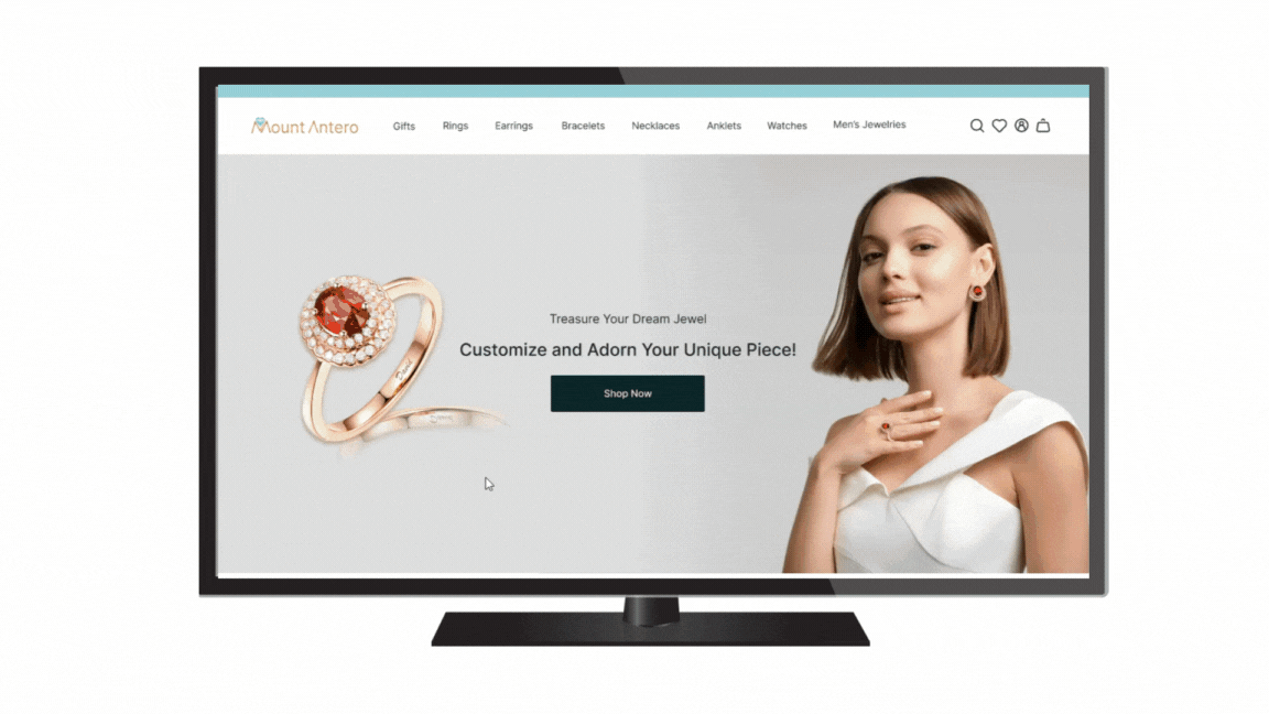
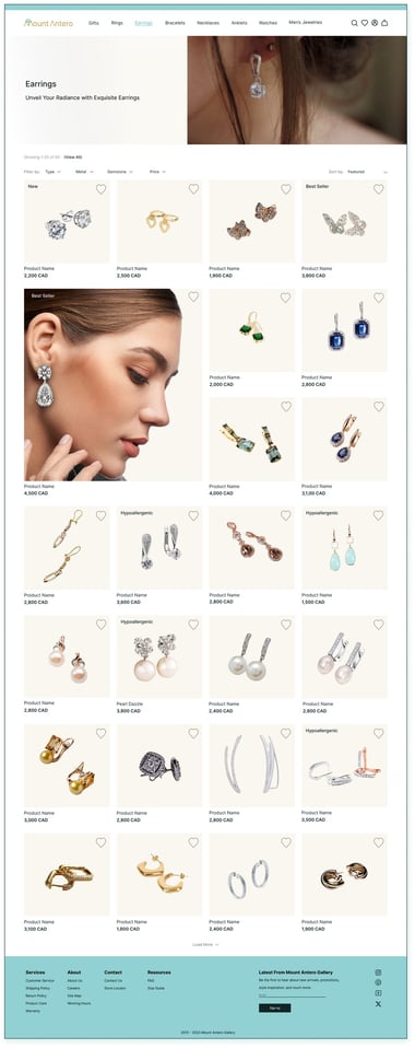
Final Version
2. User feedback revealed that, although our hero image displayed a variety of designs, the customization feature was noticeably missing. In response, we updated the image to a more modern one that clearly highlights the available customization options.
Product Page Iterations
Version 1
Version 2
The Best Sellers section has been redesigned after users found the previous layout overwhelming with too many items on display. It now features a more luxurious design, highlighting the top product from each category, creating a cleaner and more elegant browsing experience.
A hypoallergenic products section has been added to the homepage to emphasize this key feature for users.
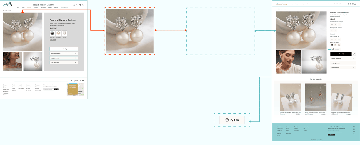
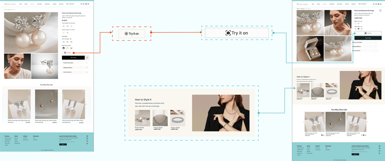
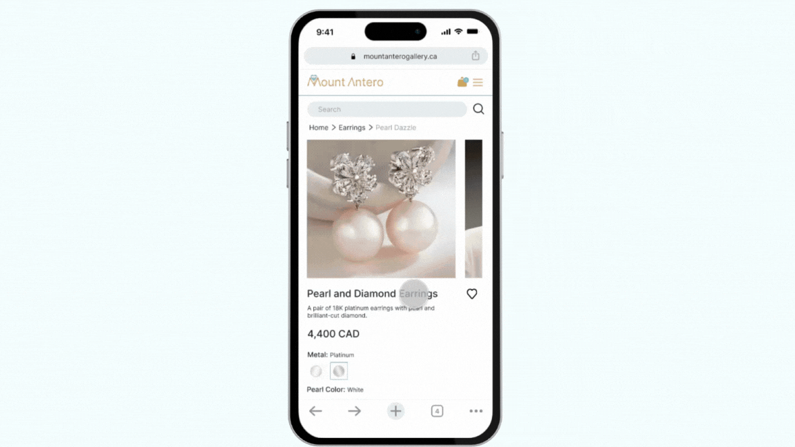
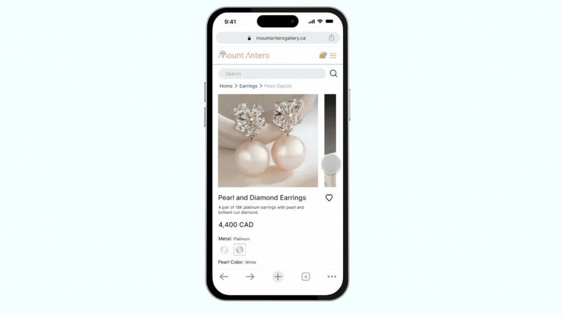
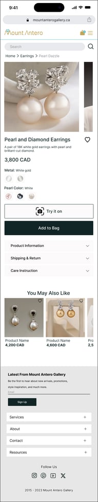
The original simple product photo has been upgraded to a new high-resolution image that allows users to zoom in while viewing it.
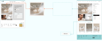
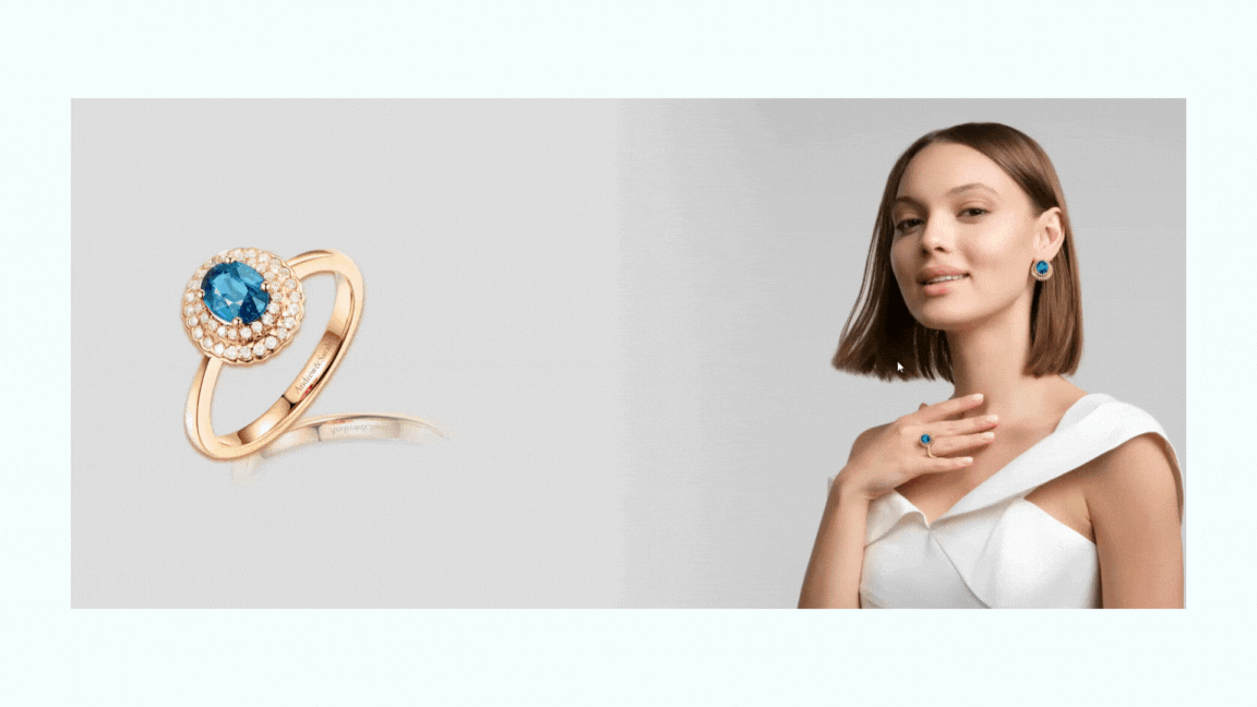
The "try-on" button has been introduced as an AI feature, enabling users to virtually view themselves wearing the jewelry pieces.
To improve clarity and ensure the Try-on feature is not missed, we have enlarged the button and introduced a new icon that better matches its content
Version 2
Final Version
3. Since our users were missing the "try-on" feature, we’ve made it a prominent button within the hero image on the homepage.
The "How to Style It" section has been added to the product page to help users pair their chosen item with other jewelry pieces on the website. This encourages them to consider buying multiple items, boosting overall sales for the business.

Virtual Try-on Iterations
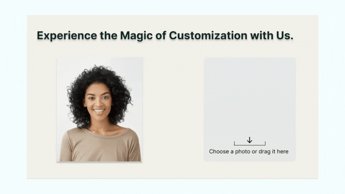
Version 1
In the first version of the virtual try-on experience, users could upload a photo to see how jewelry would look on their faces. However, the real-time feature that lets users see the jewelry directly on their faces is not available yet.
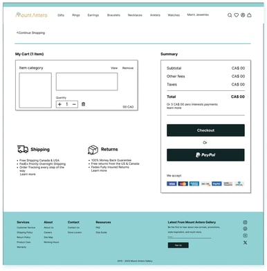
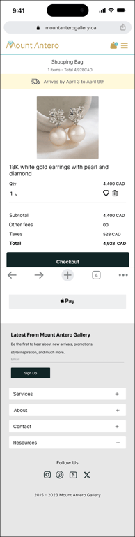
In the final version, users can scan a barcode with their mobile phone to see their faces wearing the desired jewelry. They can also upload a photo of themselves and check the chosen jewelry from different angles, either on their picture or on the model’s photo available on the website. Additionally, users can easily compare the size of the jewelry piece with other accessories.
Final Version
DELIVER
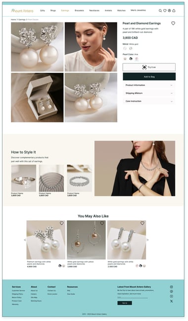
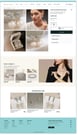
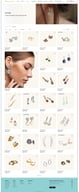

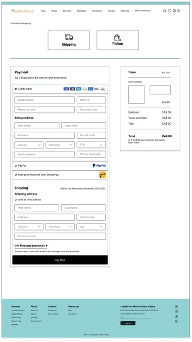
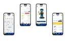
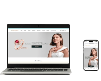
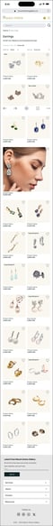
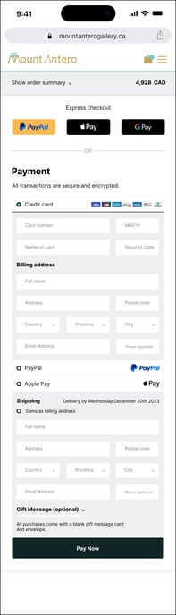
Desktop Version
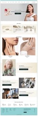
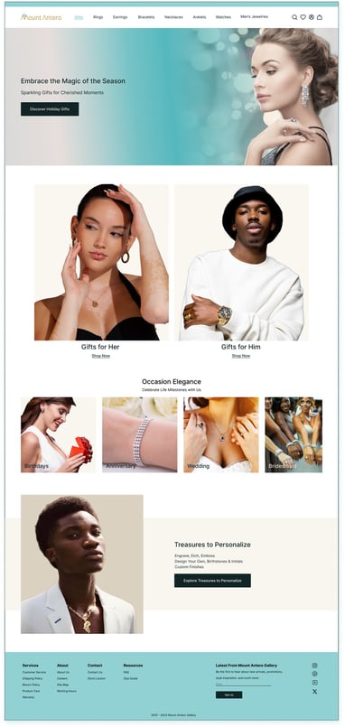
Mobile Version


Reflections
What did I learn?
Next steps
User-Centered Design: Throughout this project, we gained insights into user-centered design principles. Understanding user needs, preferences, and behaviours informed our decisions at every stage.
Prototyping Techniques: We learned how to create high-fidelity prototypes using tools like Figma, Sketch, or Adobe XD. Iterating on designs allowed us to refine the user experience.
AI Integration: Exploring creative AI features taught us about the potential of artificial intelligence in enhancing user interactions. We considered ethical implications and user privacy while implementing AI.
Usability Testing: Conduct usability tests with potential users to validate our design choices. Gather feedback on navigation, visual appeal, and the AI feature.
Refinement: Based on user feedback, refine the prototype. Address any pain points, improve visual elements, and ensure seamless interactions.
Development: Collaborate with developers to bring the prototype to life. Implement responsive design, integrate the AI feature, and create secure checkout functionality.
Launch and Monitor: Once developed, launch the website. Continuously monitor user engagement, conversion rates, and any issues that arise.